Have you ever had difficulty recalling information from a cluttered webpage or poorly organized presentation?
Or have you ever been captivated by an infographic that seems to easily simplify complex information?
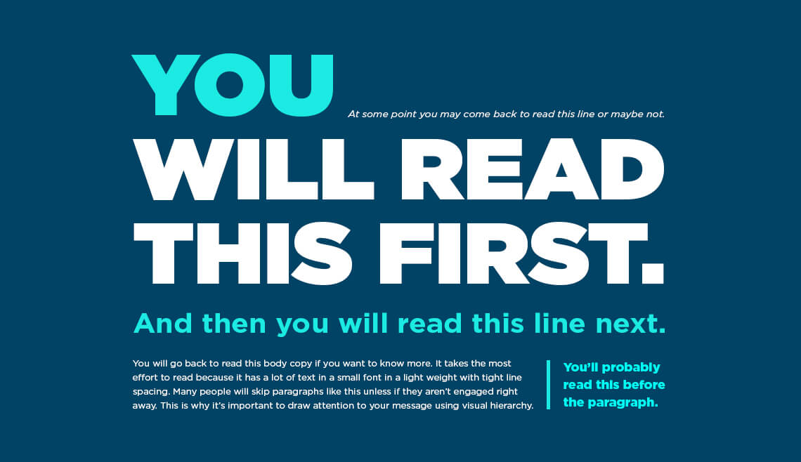
What you see here, at work, is visual hierarchy — the arrangement of visual elements in a well-structured order of importance.
But this isn’t just aesthetics that are coming into play. Order, in general, plays a crucial role in cognitive processing and memory.
Here, we’ll explore the science behind the power of order, and how visual hierarchy can enhance our memory and recall as consumers.
What is visual hierarchy?
So going back to explaining what visual hierarchy is —
In visual hierarchy, colors, shapes, sizes, and placement are arranged in a way that guides the viewer’s attention and emphasizes the most important information in a clear, cut manner.
Information can be understood, remembered, and acted upon easier when it is beautifully organized visually. Well-done design that applies effective visual hierarchy is like giving a map in a viewer’s hands that helps guides their eyes logically and intuitively through the content.

Key principles of visual hierarchy
There are some key principles of visual hierarchy that help designers create clear and effective designs.
However, these building blocks of visual hierarchy are worth noting even for non-designers, but businesses and creators in general:
- Size — Generally, using size variations helps to establish a clear visual hierarchy. Bigger doesn’t necessarily mean better, but creating larger elements does give attention to smaller ones.
- Contrast and color — Contrast in color or hue helps create visual separation and draws attention to important elements. As evident, brighter colors draw in greater attention than duller ones.
- Typography — Distinguish different levels of information using variations in font size, weight, and style. Headings and titles should be more prominent than body text. Having variation in fonts and sizing in text helps emphasize what’s most important.
- Alignment — Elements that are aligned with each other create a sense of order and unity. Use consistent alignment to create visual harmony. How a text is aligned can determine the direction in which the viewer reads things.
- Proximity/Grouping — Group related elements together to visually connect them and separate them from unrelated elements. This is great for showing relationship between two things. The further you put them apart, the less they seem associated.
- Repetition — Repeating certain design elements, such as colors, shapes, or patterns, creates visual consistency and helps with recall and recognition. By repeating colors, fonts or styling throughout a visual composition, you help everything look cohesive as one whole.
- White Space — Empty or negative space around elements helps create visual breathing room and emphasizes important content. Negative space is a good way to create focus and allow the eyes to pay attention to specific items on your design.
- Directional Cues — Utilize lines, arrows, or implied movement to guide the viewer’s eye in a desired direction or sequence. Not only does this help to literally direct the eyes to the focal point of your presentation, it can create an illusion of structure.
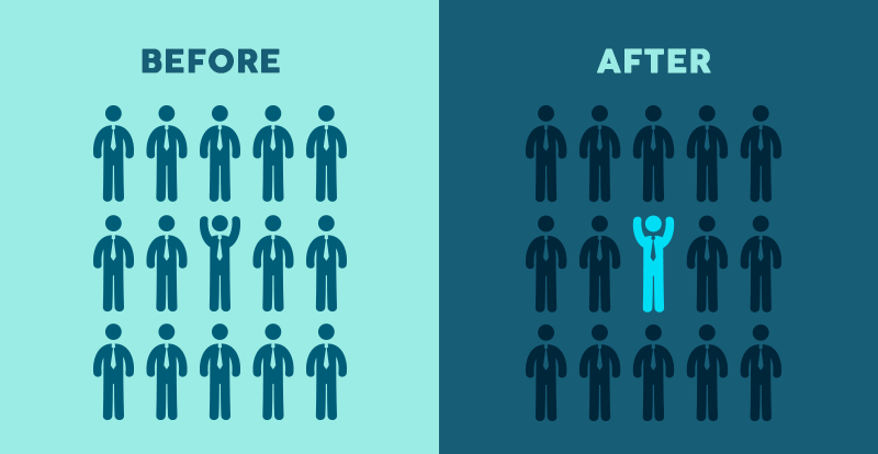
- Focal Point — Create a clear focal point by placing the most important element in a prominent position within the design. You can also create a focal point by differentiating it with color, shape or size. It is what the eyes should notice first.
Our visual brain
Our brains are wired to recognize patterns and prioritize information. According to research, we know that visual information is processed quicker and more efficiently than text-based information.
In fact, brain can identify images in as little as 13 milliseconds, which is faster than a blink of an eye, according to a study published in the journal, Attention, Perception, and Psychophysics.
Using visual hierarchy in presenting things — whether it be designing a web app or simply giving a presentation — you can deliver information in a structured way to emphasize the most important elements, and thus guiding the audience’s eyes on what to focus on.
By doing so, we are more likely to remember the information being fed to us, as we present them in a logical and clear hierarchy. Many UIUX designers do this, where they may make a headline larger and bolder than the body text, which helps to emphasize what to read first.
Visual hierarchy on memory
A visual hierarchy plays a big role in memory.
Working memory helps to store and manipulate information for short periods of time. But working memory has a limit, as we can only hold so much info at a given time.
Visual hierarchy helps us utilize our working memory more efficiently because it lets us focus on the most important stuff and remember it easier.
For example, using the principle of contrast is one way visual hierarchy improves working memory.
It’s easy for us to remember when two elements are close to one another and have a lot of contrast, like black text on white. Because of this, highlighters are often used to draw attention to important info in books and documents. Our brains find it easier to remember stuff when it’s different from the rest of the text.
Working memory is also enhanced by visual hierarchy through grouping.
Our brains naturally group visual elements that are close together or have similar characteristics together, so by putting things in proximity of each other, our brains create a relationship of the items together.
Final thoughts
Overall, good visual hierarchy can enhance cognitive processing and memory of information.
When you present information clearly and in a logical way, users are more likely to stay engaged. This is essential for websites and presentations that are meant to teach, inform, or persuade.
The power of visual hierarchy lies in its ability to enhance our ability to process and recall information by presenting it in an organized and clear way.
Whether you’re designing a website, making a presentation, or learning something new, understanding visual hierarchy is crucial for effective digestion of information.
Considering we live in an age of information and visual mediums, knowing the power of order and how visual hierarchy effects us can make or break whether you capture attention or not.