While we may not be consciously aware of it, colors have a profound impact on our brains and perceptions.
We are surrounded by colors, and without even knowing it, it profoundly influences our mood, emotions, and even decision-making processes.
This article explores how color influences our brains and how such design preferences could influence decisions.
Colors and our emotions
Among the most well-known ways color impacts, our brains are through our emotions.
The use of certain colors can evoke specific responses. Designers often use this knowledge to create effective marketing campaigns and elicit a call to action.
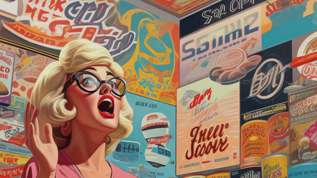
Red, for example, is often associated with strong emotions, from passion, excitement to love. It can create a sense of excitement and urgency, but it can also trigger feelings of danger or emergency. This is often why many companies and brands use red to illustrate a warning, as designers leverage red in their interfaces as an association with error states.
Both blue and/or green, on the other hand, is associated with calmness, trust, and security. Green, for example, is known to be one of the most relaxing colors to our human brain, perhaps due to its association with nature. This is exactly why many financial institutions and/or healthcare companies use green to instill a sense of serenity and stability.
Colors and our memory
It is also possible for color to affect our memory.
Research shows that people tend to remember colored images better than black-and-white information. The reason for this is that color adds a level of visual interest that makes the information more memorable.
There are countless studies that show that color influences memory by increasing attentional levels and arousal. For example, one study by Wichmann et al. demonstrated that participants in their experiment performed 5-10% better on identifying images that passed in 50 milliseconds, compared those of black-and-white tone. Another study showed that out of 120 participants in their experiment, recognition of neutral scenes was 5% higher in colored conditions compared to those of grey scale conditions.
Some of the ways colors help with memory is that it helps with:
- Attention and encoding — Bright or bold colors are more likely to be noticed and encoded in memory. The more distinct a color comparatively to the full picture, the easier it is to encode it into memory and recall for later on.
- Association and contextual cues — Colors can also serve as contextual cues for our brain to reference back later. We can associate specific colors with categories, and this helps to retrieve that information from memory later. Also known as color coding, this is when we use colors as a mnemonic device.
- Emotional arousal — As mentioned earlier, certain colors can evoke specific emotions and influence mood. When experiencing emotional arousal, whether positive or negative, we can increase retention and recall.
- Visual salience — Using specific contrasting colors can make information more distinct and salient. When information stands out, such as a highlighted text, it becomes easier to tap into our working memory, which has been shown to affect performance.
- Cultural and personal association —Beyond just the emotions we feel, colors can also be associated to specific meanings we place on them in our personal lives or cultures. With these connections built inside of our mind, it is easier to recall said information.
How colors affect our decision-making
So what does this all mean for us as consumers or creators?
Well for one, decision-making processes are heavily influenced by color.
According to research, 70% of quick judgments on consumer products are made based on color alone. For example, with vehicle purchases, 60% of consumers identified color as being a key factor in their purchasing decision.
As Dee Shlotter, PPG’s senior color marketer notes,
“Whether it’s the color of the car you are buying or the color paint you are purchasing for a new bedroom, color often reflects your personal style, while also transforming the ambiance of the space or product. Certain colors can also gain popularity or evoke specific feelings due to societal or economic trends”
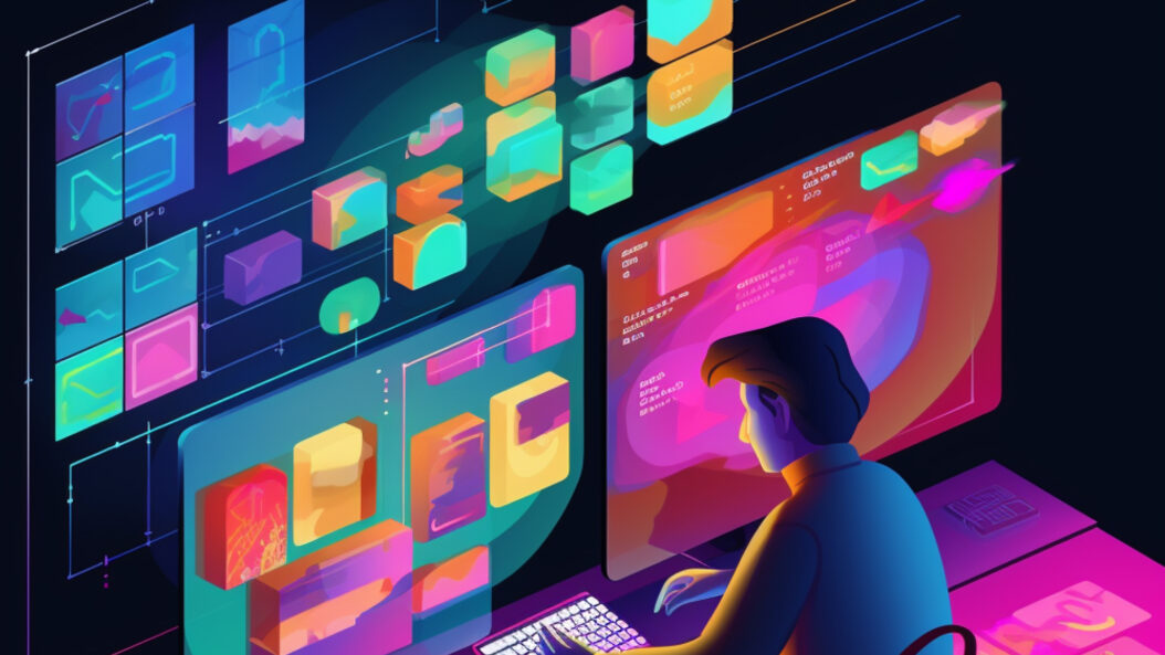
How designers use color
With the profound impact that colors play on our brains and behaviors, it is only natural that designs of all shapes and sizes, from website landing pages to presentations, should make use of this color psychology.
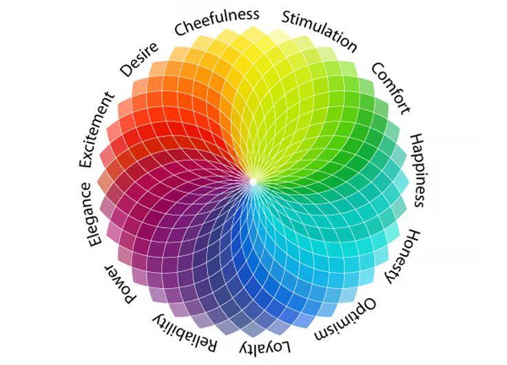
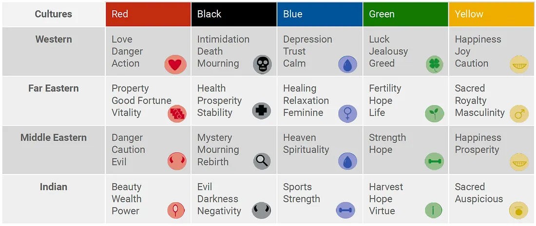
However, before designing anything, it’s important to note who your target audience truly is, as cultural, personal, and experiential preferences affect what that color means to us. As evident from this graph, we can see that the same given colors can mean different things in that specific culture.
What this means is that, when designing a website or product for a brand, what colors you choose matters. A company that manufactures children’s toys may use brighter, playful colors such as yellow and green. But a website for a law firm, on the other hand, may use more subdued, serious tones like a dark navy blue to accentuate trust and professionalism.
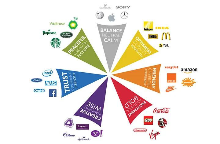
The image below shows some primary colors that many famous brands use to evoke and associate a particular emotion with their company.
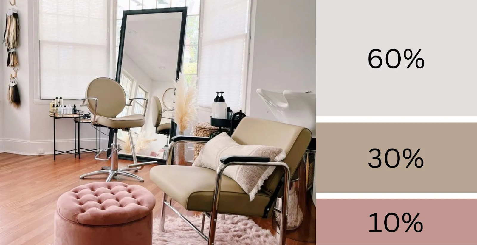
Using the 60-30-10 rule
For creating well-balanced and visually appealing color palettes, use what designers know as the 60-30-10 Rule.
This is It’s based on a rule that one color makes up 60% of your palette, followed by a secondary, complementary color, which makes up 30%. For the remaining 10%, a third color should be used as a highlight, to give that added accent to your visual composition.
The combination of these colors gives a sense of balance.
This doesn’t only apply to visual design, but is a common rule that is followed even when it comes to interior designing as well.
Key takeaways
Our perception of the world is shaped by color, which is a powerful tool. We may not be aware of it, but the colors we see can affect our emotions, memories, and decision-making.
Knowing about the importance of color helps us as consumers and creators, to be more aware of how we’re processing the advertisements, presentation, and information better.
Once again, it’s important to note that while certain colors do have a general universal meaning to it, cultural differences can play a huge part to what colors mean to that person. What might make sense to one target audience may mean something entirely different to another. This is why researching and testing color choices when building a product of any kind is imperative.